Many people have great ideas for direct mail marketing and catalog design; however, few people can overcome the initial intimidation of actually carrying out said design and continuing to the self-publication phase of the process. As it goes with most intimidating or fearful topics, “the bark is worse than the bite.”
The truth of the matter is that printing a well-designed catalog is a fairly simple and straightforward process if you know what you are doing — no intimidation involved. Sound good to you? Great. Let’s get started with a few catalog design tips to get you on your way.

It is important to have a firm understanding of the “big picture,” i.e. what your specific catalog publishing will entail within its catalog design 101. For instance, you should know how many pages your catalog will be comprised of and in what order you want your merchandise to show. You should have an understanding of page layout and make a decision concerning how you want your catalog to be opened and viewed from cover to cover.
You should have one of your most-eye catching products featured within the first page or two. The functional aspects of the catalog design process may not be the most fun aspects; however, they are very important aspects to consider if you want your catalog to be a success (and who wouldn’t want that?).
People who do not have a great deal of experience in the design field often think that pictures are far more important than words. After all, the saying “a picture is worth a thousand words” must apply in catalog design 101, too, right? Wrong. A catalog with poorly chosen font will be an immediate source of criticism for design-savvy individuals.
Even consumers can “feel” when a catalog has poorly chosen fonts. These catalogs are typically far more unprofessional in appearance. Stick to clean fonts that complement each other well — and please, please don’t use Comic Sans.

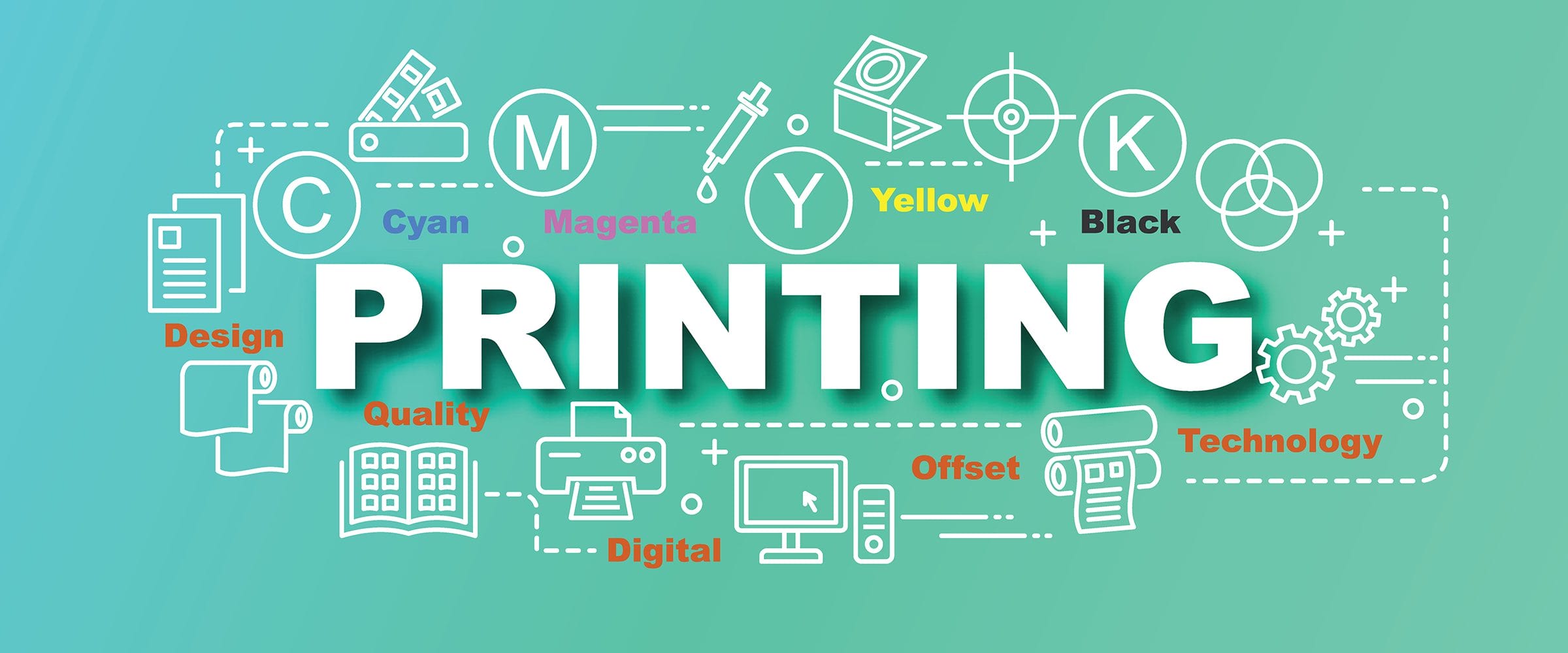
The colors you use in your direct mail catalog marketing may not seem like a big deal, especially if design is not your forte. Nothing could be further from the truth, however. Color is everything when it comes to good catalog design 101.
Without eye-popping colors that are applied with a great deal of thought, people may just pass up your catalog without a second glance. Obviously, you want your viewers to spend a little time leafing through the catalog you have worked so hard to complete!
Keep this information in mind as you plan out and implement your very own self-published catalog. You may be surprised by how successful you are as you direct your time and energy in a well-researched manner.
Once you’re ready to publish your art books, you’ll find that Publishing Xpress has lots of great options for you—including four different binding styles, lots of paper options, lamination of covers, quick turnaround, and outstanding customer service. Plus, we always stand behind our 100% satisfaction guarantee, so you never have to worry whether you’ll be happy with your printed product.
When you’re looking for art book printing companies, it’s always a good idea to do your homework. Be sure to request a free sample package and printing quote for your project. The plastic coil book in the sample package has a sample of all our paper options as well as gloss and soft-touch lamination. We’re happy to provide everything you need to make the right print decision.
Check out our catalog printing service if you are looking to print a catalog. And take a look at our numerous 5-star Google reviews to see why our clients love working with us!
© 2025 Publishing Xpress. All Rights Reserved.
